Friday, April 26, 2013

Polar Players

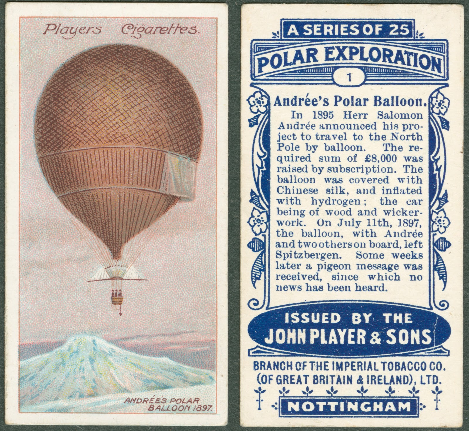
A card with an illustration and text block on Andree's Polar Balloon.Sometimes, as we get older it is easy to forget the excitement of mystery, but in Rauner we have countless items that recapture that childhood imagination—like the Player's Cigarette Cards.  The cards, which came with Player's Cigarettes, each feature a different representation of Arctic exploration: from explorers to ships and the formation of Icebergs, every card tells a short story about the frozen ends of the Earth.

A card with an illustration of the northern lights over a snowy cabin.
One of my favorite of the cards features "Andrée's Polar Balloon." It describes Herr Salomon Andrée, who raised money for his Polar hot air balloon, made from Chinese silk and filled with hydrogen. A few weeks after his departure, a pigeon message was received, after which nothing was heard from him again.

A pile of illustrated cards.
The mystery lies not only in each story, but also in the story of the cards' circumstance: who collected these cards? Were they meant for kids, despite their being contained in cigarettes cartons? What is the connection between cigarettes and polar exploration?

A card bearing an illustration of a group of men smoking, drinking, and playing music together.
If you come by Rauner and ask for Realia 536 you can find out the answers to some of these questions, but even more importantly, you can look at these beautiful cards and discover questions of your own!

Posted for Lucy Morris '14

Tuesday, April 23, 2013

Waste Lands

A title page for "The Waste Land."
We have three "firsts" of T.S. Eliot's The Wasteland. Two variant copies of the first American edition, each with typographical oddities of interest to obsessive collectors, and the first English edition. They are all fascinating in their own right but two things jumped out when we had them pulled for a class last week.

One of our American editions published by Boni & Liveright in 1922 still has its original dust jacket--a rarity in itself--but also a bookseller's advertising tag attached. On the bottom corner of the back cover is simple ad for the original seller of the book, The Old Corner Bookstore in Boston. At the time, it was the largest retail book outlet in the country. It was known as the haunt of Boston's literary elite, but was also famous for innovative sales gimmicks--this being one.
A paper cover for "The Waste Land."The back cover.

The first page of "The Waste Land."
The first English edition will give you goosebumps. It was published by Leonard and Virginia Woolf at the Hogarth Press in 1923. Virginia Woolf herself hand set all of the type (she said her hands were shaking when she finished). The Woolfs had impeccable taste as publishers, but they were not the best printers the world has seen. The type was unevenly inked in the printing process giving the page a blotchy look. In a way, that just makes Virginia's work more apparent and heightens the aura of the book. You can see the handmade quality.

Come see all three by asking for Rare PS3509.L43 1922 copies 1 and 2, and Val 817 E42 Y512.


Friday, April 19, 2013

Finding Neptune

The title page for "An Explanation."
Uranus, the seventh planet, was officially discovered in 1781 by William Herschel and at that time was thought to be the farthest planet from the sun. However minor variations from its observed orbit and that predicted by computation indicated that an additional body might be present further out that was responsible for the perturbations. The challenge of calculating the hypothetical orbit of such a body and thus pinpointing its location for observation was independently taken up by Urbain Le Verrier and John Couch Adams. Unfortunately for Adams, Le Verrier published first.

Adams presented his findings to the Royal Astronomical Society on November 13, 1846, approximately two and half months after Le Verrier's calculations had been made public at a meeting of the Royal Academy of Sciences in Paris. In his paper An Explanation of the Observed Irregularities in the Motion of Uranus: On the Hypothesis of Disturbances Caused By a More Distant Planet; With a Determination of the Mass, Orbit, and Position of the Disturbing Body (London: W. Clowes & Sons, 1846) Adams discussed his own interest in the problem and attempts to resolve the issue but ultimately credited Le Verrier and Johann Galle with the discovery of what we now know as the planet Neptune.
I mention these dates merely to show that my results were arrived at independently, and previous to the publication of M. Le Verrier, and not with the intention of interfering with his just claims to honours of the discovery; for there is no doubt that his researches were first published to the world, and led to the actual discovery of the planet by Dr. Galle, so that the facts stated above cannot detract, in the slightest degree, from the credit due to M. Le Verrier.
Adams then goes into details of his attempts to calculate the orbit and the various methods that he employed. This was a tedious process of testing various hypotheses and then calculating the predicted orbit from those equations and comparing the predictions to observed data.

Rauner's copy of Adam's paper is a presentation copy from the author to a Lieutenant W. S. Swafford, R.N. Ask for Rare Book QB 681 .A32 1846.

Tuesday, April 16, 2013

Small, Smaller, Tiny

A hand holding a miniature, gold stamped book.
In Rauner, books come in all shapes and sizes. Indeed, some of our most interesting items can easily fit in the palm of your hand. Rauner's miniature books show that with some creativity and a small enough typeface, you can cram just about anything into a tiny book.

A hand holding a miniature book in Arabic.
The smallest of the miniature books is a Koran approximately the size of someone's thumbnail. Written in Arabic, the words and designs within are impossibly small. However, the miniature book solves the problems inherent to its size through packaging. The book is enclosed in a small metal locket with an inset magnifying glass: a perfect fusion of style and practicality. It's owner, none other than Lawrence of Arabia, would have needed to travel light as he crossed and re-crossed the forbidding deserts of the Middle East during the First World War.

A hand holding a miniature book open to the title page: "The Fairy Annual."
Another one of Rauner's smallest books explains its diminutive size through fantastic origins. Robin Goodfellow, "Attendant Sprite to Their Majesties Oberon and Titania," published the Fairy Annual in 1838. Inside lies a series of stories, poems and illustrations of fairies and other magical creatures. The book is almost too small for a human to read. However, elegantly bound in brown leather, the book would look perfect on the bookshelf of a fairy about one twentieth of our size.

The Diamond Etiquette of Courtship and Marriage (pictured above), conversely, is clearly intended for human use. Published in 1845, the pocket-sized book seems to be written on the concept that one never knows when they may need advice regarding their love lives. The book walks the reader from courtship (one must avoid being seen as a flirt) to marriage (and the associated end of intimacy with one's "bachelor friends.") The miniature nature of the book was likely more for show than practicality. However, the image of a nineteenth-century lady or gentleman pulling The Diamond Book of Etiquette from their sleeve upon a proposal of marriage demonstrates the usefulness of miniature books in urgent etiquette situations.

A miniature book of marbled paper with a pop-out block of text.
A final miniature book that could come in handy if discretely tucked away is I've Called You All Together… A Book of Toasts. I may not need The Fairy Annual or The Diamond Etiquette on me at all times. However, the extremely portable size of the Book of Toasts makes it ideal for every occasion. While the other items resemble normal books shrunk down several magnitudes, I've Called You All Together is styled for readability. The book uses accordion style binding to publish a series of toasts. Snippets include, "May we look forward with pleasure, and backward without regret," and "May your children have rich parents." The book is one of only fifty, so your dinner companions will think you have the most original toasts at the table when you subtly pull this out. Rauner has hundreds of other miniature books for all occasions, whether you want to have the Gettysburg Address or Humpty Dumpty in your pocket at all times.

Check out Rauner Miniature 117 for The Diamond Book of Etiquette, Presses P389iv for I’ve Called You All Together, Miniature 77 for The Fairy Annual, and Lawrence BP130.4 .K57 for the Koran.

Posted for Kate Taylor '13.
Friday, April 12, 2013

Plat, Plot, Survey, Chart

A hand-drawn map of Meriden.
Meriden, New Hampshire
Who doesn’t love a map? There is something about the ability to see objects laid out in relationship to each other; that broad overview of things we normally only see from our grounded vantage point necessitated by laws of gravity. Even in an age when you can view the world from satellite in photographic reality, old maps can still amaze. They give us insight into a previous world, roads that no longer exist, buildings that have moved. So it is with these hand-drawn maps by Dr. Elias Frost of Meriden, New Hampshire.

A hand-drawn map of Uxbridge.
Uxbridge, Massachusetts
Frost, who was born in Milford, Massachusetts and later moved to Uxbridge and then to Meriden, drew a series of maps, from memory, of each of the towns he lived in as part of his manuscript titled the Chronicle of the Frost Family. It is hard not to be drawn into these maps with their careful, folk-art renderings of the buildings accompanied by notes about changes, inhabitants or moments in his life related to a particular place. Relationships and scale can tell us other things about the creator. For instance, it is clear that the church in Meriden was a large and important part of Dr. Frost’s life since it dwarfs the structures around it.

To enjoy Dr. Frost’s maps in person, or read the chronicle of his family, ask for: Rauner Codex: 853310.

Tuesday, April 9, 2013

Getting Back to Knopf

A typed letter.
Imagine establishing yourself in business in rural Vermont as a commercial printer dedicated to impeccable design and the craft of book making and getting a letter like this. Alfred Knopf, at the time the most distinguished publisher in America, and a man who revolutionized the look and feel of trade books, personally taking the time to scold you for failing to follow through after a meeting with his production manager.  But Roderick "Rocky" Stinehour '50, managed to make the most of the situation. His reply convinced Knopf to send a job his way.

It is always a bit of a shock to learn about a small company obsessive over a pursuit that seems like something out of the past—a craftsperson's obsession—that is able to turn a profit and keep up to forty people gainfully employed at any given time. Stinehour Press evolved out of a small commercial printing operation that served a community. After Rocky's introduction to printing he came to Dartmouth and trained in design. His great contribution was an unfailing belief that good design and attention to detail could be done economically and that good design did not need to be sacrificed for profit. Alfred Knopf had expressed a similar idea years earlier, when he said that a well-printed and well-designed book could be produced almost as inexpensively as most commercial books. The Stinehour Press carried that theory through five decades of quality printing and design including this work for Knopf.

A black and white photograph of a small group of people.
To learn more about Rocky and his legacy, come hear David Godine '66, on Thursday, April 11 at 4:00 in Baker Library.  There is also an exhibit in the Baker Library Main Hall, Designed and Printed at Stinehour Press, that is on display through May 31st.


Friday, April 5, 2013

Books from Blocks

Two pages of printed text and illustrations.
Fragments from the Biblia Pauperum
Netherlands, ca. 1460-1470
Wood has been used as a method of communication for time out of mind, typically by expressing an artistic ideal through the the grain and texture of the material. However, as printing evolved, the use of wood to express both a literal and figurative meaning at the same time became more prevalent. The inclusion of both text and imagery on the same block was initially most widespread in Japan, China and other Asian regions, though in Europe it actually flourished most widely at around the same time as movable type was developed. These "block-books" eventually fell into decline and wood came to be employed mainly for creating imagery to accompany the text.

A carved woodblock.
Leaves By The Wayside
Title page block for first book
printed in the Graphic Arts
Workshop at Dartmouth College, 1948.
The process of creating a woodblock for printing is a fairly simple one in concept. The desired image or text is drawn onto the block surface, but reversed from the way it will eventually appear on the paper or other page material and the "white space" is removed with a variety of woodworking tools. The remaining wood surface is then covered in ink and a sheet of paper is pressed onto it. The ink transfers from the wood to the paper, but only on those sections that have not been removed. The thickness of the woodblock is typically matched to the height of the type so that a full page can be printed in one step.

A printed page of Japanese characters.
Prajnapamita Sutra
Japan, ca. 14th century
The more elaborate the design the more care must be taken in executing it.  The wood itself must be chosen and prepared with care to minimize cracking and warping due to the wood's natural movement as it interacts with its environment and the stresses that the block undergoes in the printing process. Even a small press can produce a tremendous amount of force. An example of a block which cracked can be found in our collection of Barry Moser's Alice in Wonderland.

The examples pictured here are taken from various collections. Ask for Val 898.1 D14 U7 (Prajnapamita Sutra), Rare Book Z 241 .B6 (Biblia Pauperum) and Lansburgh 30 (Leaves By The Wayside title page illustration).