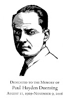
 Did you know Dartmouth has its own letters? We pass signs everywhere on Dartmouth's campus. Imagine if you were asked to design the letters. Both Will Carter and Paul Hayden Duensing are mentioned in a recent acquisition at Rauner Library: The Private Typecasters : Preserving the Craft of Hot-Metal Type into the Twenty-First Century, Newtown, PA : Bird & Bull Press, 2008.
 "The Private Press and Typefoundry of Paul Hayden Duensing takes pleasure in presenting the first showing of Dartmouth title designed by Will Carter." "Mr. Carter designed Dartmouth as a titling letter for the college... for signage and other display uses." "For this cutting new figures based on Octavian have been redrawn by Will Rueter, Toronto, to work with the letter. Dartmouth has been cut in the 22 point size in May and June of 1991 at The Private Press and Type-foundry of Paul Hayden Duensing and was the last complete font cast at Vicksburg, Michigan before the PP&T relocated."
To see an example of Dartmouth letters, see:
Author: Carter, Will, 1912-2001.
Title: [Alphabet of capital letters for Dartmouth typeface] [realia]
Imprint: [S.n. : s.l., 1965?]
Description: 28 hand carved wood blocks representing the capitals letters designed by Will Carter for the Dartmouth typeface.
Ask for: Rauner Realia 510
 To see a different example of Dartmouth letters, see:
Author: Carter, Will, 1912-2001.
Title: R : This letter R demonstrates the main principles behind the shaping of the design called Dartmouth: emphatically waisted strokes, with strong, square-ended serifs and clearly defined counters; perfect for incising on stone or wood. Originally conceived for some carved teak panels in the Hopkins Center at Dartmouth College, New Hampshire, it was later adapted as a type-face.
Imprint: [Hanover, N.H. : Will Carter, 1969]
Description: 1 broadside ; 40 x 26 cm.; "Prepared by Will Carter as a keepsake for his friends at Dartmouth College to record his stay as Artist-in-Residence during the Spring Term 1969."
Special Collections/Broadside copy: Author's autograph presentation copy, inscribed to Bernard Cohen.
Ask for Rauner Broadside 969940.2
No comments :
Post a Comment