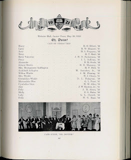
While looking for something else this morning, we stumbled across this provocative illustration from the 1921 yearbook, The Aegis. Wow, what does this say about students who were not athletes? It is easy to read a lot into this image, but it does demand some context.
Up until the 1920s the Dartmouth Players were an all male theater group (they began inviting women from other colleges to take the female roles later in the decade). On an all-male campus out in the "wilderness," cross dressing was not as uncommon as you might expect. Many of our student scrapbooks from the early part of the 20th century show pictures of male students camping it up in drag.
So, on one level, this is just a humorous depiction of one of the most important non-athletic extra-curricular activities on campus--the theater. On another level it is an example of the prevalent chauvinism of the era, one that was played out intensively on an all-male, elite campus. By that reading, if you are not an athlete your masculinity is in question.
Friday, July 13, 2012
Tuesday, July 10, 2012
Elemental Style
How do you illustrate language wars? In the May 14th issue of The New Yorker, Joan Acocella writes about the tension between prescriptive and descriptive language guides. Prescriptive manuals tell you what you ought to do to be correct, descriptive guides try to articulate current and past usage without necessarily judging correctness. Sam Winston, one of our favorite book artists, gave it a shot.
He typographically shredded two famous prescriptive guides, Strunk and White's Elements of Style and Henry Watson Fowler's A Dictionary of Modern English Usage, and set them into a vortex of devolving forms. The letters dangle and words break apart as the texts churn together. The text is from Wikipedia entries and add to the tension. They are crowd sourced (similar to descriptive guides) while their subjects are prescriptive. Which is falling apart? It is your call.
We recently acquired a copy of Sam Winston's illustration as a letterpress broadside. It changes out of the context of the magazine. The illustration becomes a more self-conscious work of art and you pay more attention to the swirling texts. The slipcase elevates it even more, but then you realize these are just a couple of Wikipedia entries, and it is hard to take it quite so seriously.
We haven't got it cataloged quite yet, but you can see it by asking for Sam Winston's New Yorker.
Subscribe to:
Posts
(
Atom
)