 Typographers tend to be a humorless lot when it comes to matters of design, but they love to have fun with the ostentatious excesses of their craft. Case in point: display advertising and the adman's gimmicks.
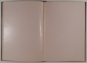
This book, The Advertiser's Typographic Manual, which sports such an aesthetically pleasing gold-stamped cover, is from the book collection of Dartmouth's legendary Ray Nash. Nash founded the Graphic Arts Workshop (now the Book Arts Workshop) and trained generations of talented typographers in the basement of Baker Library. We opened the book to see what advice it had to offer would-be advertisers and discovered a completely blank book. At first we figured it was a publisher's dummy (a mock up for a book) but then saw what a good joke it must have been for Nash. The complete typographic knowledge of the advertising world could be summed up with a book that contained absolutely nothing. You can just picture Nash pulling it off of a shelf and handing it to a student interested in advertising, and saying "Here's all you need to know."
Of course we could be all wrong--it could be a mock up for a book that never made it into print, and we are just reading into it an elaborate joke. But, really, why would Nash keep it?
We are still trying to figure out how to catalog this one, but when we do, we'll add a link to the catalog record so you can see it yourself. [August 23, 2016: we figured it out. Ask for Rauner Nash HF5825 N374 1940z].

No comments:
Post a Comment