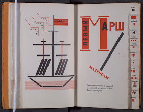
 Vladamir Maiakovsky's poems were meant to be read aloud; in fact, the title of this book, Dlia Golosa (Berlin : R.S.F.S.R. gosudarstvennoe izdatelʹstvo, 1923) translates to For the Voice. El Lissitzky applied his Constructivist aesthetic to the book. Drawing
primarily on display types and decorative devices common in printing
shops he illustrated the poems and created emphasis. You have to wonder, if the book is meant to be heard rather read, why the lavish typographic attention?
 Lissitzky delineates each the poems with a tab. The layout and decoration of the book gives it the feel of a medieval litergical book--albeit one with a radically modernist aesthetic. The tabs steer the reader through the text making it simple to select a poem at a glance, and the typographic designs act as decorated initial letters to stir the reader into the proper oratory mood. The mission was similar--read out to the congregation, the texts were meant to inspire their souls. The final product is a masterpiece of Constructivist book design and a great example of early Soviet experimentation in the arts.
You need to see this book to really appreciate it. Ask for Rare PG3476.M3 D57.

No comments:
Post a Comment